Bruce Stainsby's Blog: Muttering from the mo

What is art?

November 10th, 2011

MONA is a relatively new private art gallery and museum in Hobart, Tasmania.

Created by David Walsh who made his fortune from gambling.

Wikipedia describes him as: “A university drop-out and autodidact with mathematical skills. Walsh made his fortune by developing a technical gambling system used to bet on horse racing and other sports globally”.

However he would prefer you to read this piece from the gallery website:

“The locals have started calling him ‘Dave’ (‘Hey, that’s Dave Walsh. Dave! Oi, Dave!’) but in fact his mother named him Glenn. Then she found God and changed it to David. It is estimated that at least one woman has been turned off dating David when she found out his real name was Glenn. As a result (of ambivalent relationships with women? of his changing name? of God?) he decided to build a museum”.

MONA is an eclectic collection of old and new art; hence the name is an acronym for the Museum of Old and New Art.

Neolithic flints and Egyptian mummies are mixed with confronting video installations and puzzling art in all mediums. There is even a poo-generating machine titled ‘Cloaca Professional’ by Wim Delvoye, (Born 1965, Wervik, Belgium; lives and works in Ghent, Belgium).

What is almost as intriguing as the art is the use of computer technology.

Every visitor receives an iPod on entry; this is your gallery guide. There are no descriptions on the art work, so if you are interested in a piece you read about it, or listen to it, on the iPod.

This description gives you the usual stuff, like who did it and when but it also has other sections, like interview with the artists and a section called Art Wank. This is what you would normally read on a traditional gallery wall. Some also had Gonzo, a section, usually written by David Walsh that gives less intellectual and more introspective thoughts and comments on what you are viewing.

You can also cast your opinion on what you see as you travel through the exhibition. Rumor has it that David Walsh will remove any exhibit that becomes too popular.

There are things there that you just look at. I guess that’s the museum side and then there are a lot of other pieces that make you stop, scratch your head and think.

There is even a public toilet that literally let’s you see what you are doing.

But is that art? Certainly Wim Delvoye, (Born 1965, Wervik, Belgium; lives and works in Ghent, Belgium) thinks it is.

MONA

Symmetry and asymmetry.

November 3rd, 2011

Winston Churchill had lopsided features, which may be a link to why he was such a successful leader of Britain during WW2.

Psychologists have discovered that people with asymmetrical features make the most effective leaders.

I wonder if the same theory might be applied to art in its historical context?

Throughout history the arts have lurched between the Classical and Romantic, or symmetry and asymmetry.

The most well known period was the Renaissance, a time of classical beauty and symmetry. This was then followed by the Baroque, a period of disturbance, mayhem and asymmetry.

This is best seen in Michelangelo’s two great works in the Sistine Chapel, Rome. The ceiling is calm and ordered, in the High Renaissance style, while the Last Judgment, in the Mannerist style, was much more chaotic. This was the pre curser to the Baroque period, where art and sculpture displayed more exuberance and exaggerated motion.

Advertising has also followed the same swings. In the 60s there was the Helmet Krone inspired VW campaign and in the 70s and 80s we had the classic British print campaigns like Sainsburys, Commercial Union and Stella Artois.

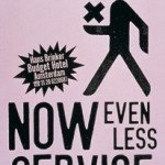
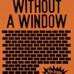
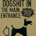
Then came the dark days of the mid 90s. This brought the off the wall and totally asymmetrical work out of Holland like the Hans Brinker Hotel work from KesselsKramer, Amsterdam. The advertising was so unusual that they even published a book titled; “The Worst Hotel in the World”

I wonder if, when times are tough, we don’t need the off the wall, asymmetric approach to selling?

After all there has never been a more confusing market place than now.

The stock market lurches between Bear and Bull and the politics waver between The Tea party and the Occupy Wall Street movement.

The WWW has opened up the Pandora’s box, that’s new media, and know one knows where that will lead us.

Or perhaps we just need some talented creative directors with lopsided features?

The power of an urban legend.

October 24th, 2011

Wine growers, or maybe it’s the wine marketers, seem to understand the power of a yarn.

The Boobook owl is the story that Forest Hill Vineyards, in the great southwestern region of Western Australia, use to market their Cabernet Merlot variety. Apparently the owl’s very distinctive call can be heard around the vineyard at night.

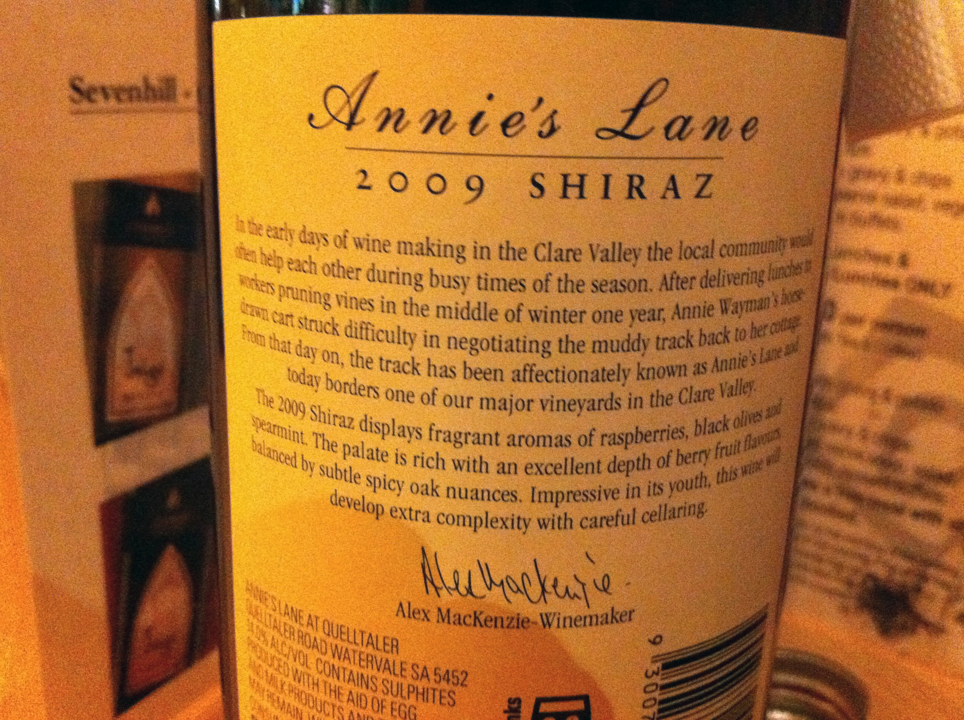
While the name Annie’s Lane, in the Clare Valley, came from the story of Annie Wayman. This is what’s on the back of their label.

“Annie Wayman was a legend in the Clare Valley. She could always be relied upon to bring along sandwiches and a warm drink to harvesters and pruners in the vineyard at the turn of the 20th century. One evening, Annie’s horse and cart got bogged in a lane adjacent to one of the valley’s best vineyards. Thus, Annie’s Lane was born.”

Most people buy wine just before they consume it and most are heavily influenced by the label, so what better way to get these impulse buyers to choose a product, than to give them something to remember it by, a good story?

Henry Ford famously made the claim about the colour range of the Model T.

“Any customer can have a car painted any colour that he wants so long as it is black.“

It’s these stories that empower the consumer to talk about a product and that’s the best way to get it remembered.

The copywriter has long used story telling to aid brand association. However with the current trend, of little or no copy in ads, this art has been lost.

I guess I will just have to read more wine labels.

Caravanning isn’t daggy but the vans are.

October 10th, 2011

One of the biggest problems facing the caravanning set is their image.

Not them personally, however they do need to get rid of the silly hats, but the image of the small block of flats they are towing.

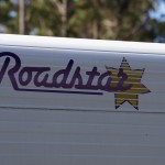
Caravanning became popular in the US in the 50s’ and it seems as though the graphics used by the manufactures has been caught in a time warp from the same period.

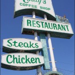
The Googie design style was used by bowling alleys, petrol stations and caravan manufactures, with great success, just after WW2.

This retro look has been made popular again by companies who want to hark back to a simpler era, however it sends the wrong message when it comes to contemporary long haul touring.

I toured Europe in the 70s in a VW Combi Van and, for the time, it was state of the art.

It had a modern look that was devoid of all the crap graphics that are so prevalent on today’s motor homes and caravans.

Their exterior belies what is inside these travelling condos. They have Sat Nav, wireless internet and solar electricity, yet they look like they have come from an episode of Father Knows Best.

The Grey Nomads, who travel the planet in these mobile penthouses, are being branded as daggy by the very image of the brands they driving.

The man who made history, is history.

October 6th, 2011

Steve Jobs was a modern day Leonardo da Vinci, a technical visionary with an aesthetic taste for art, design and typography.
Every time I turn on my Mac, answer my iPhone or listen to my iPod, I will think of him.

There ought to be a law against it.

September 26th, 2011

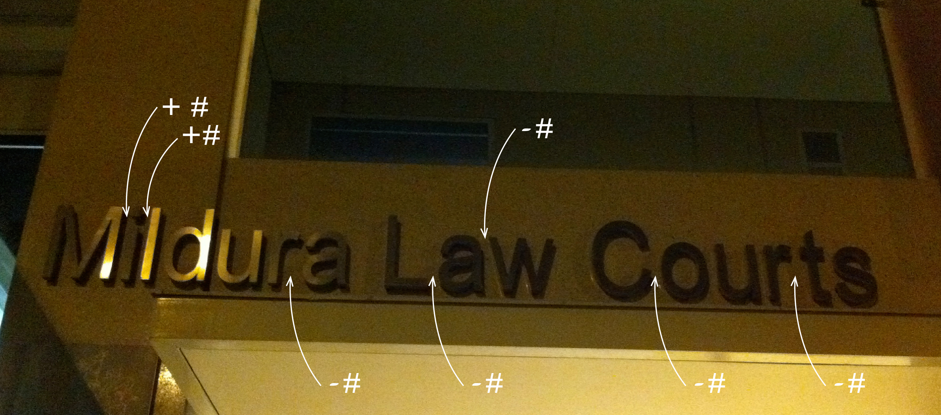
The new law courts in Mildura boasts some very glitzy relief lettering above the entrance.

This is the worst piece of kerning I have ever seen. (Kerning is the art of adjusting the space between individual letters, in a word, to create a pleasing appearance)

How come the Greeks and the Romans could carve letters from solid marble and get it right but the Mildura Public Works department, with the aid of CAD get it so wrong?

It’s in fact these very computers that we should blame for this abomination.

Hand lettering, monotype, linotype and Letraset all allowed the letters to be visually kerned by the typographer.

This all changed, with computers becoming a design tool and many fonts coming without any form of kerning. This is similar to the old typewriter where the space occupied by each letter was always the same.

The result is what we see here.

It’s a crime.

The Nullarbor and back.

September 23rd, 2011

I have just posted a few of the snaps I took on our Nullarbor trip.

Once again the basic rule of photography was reinforced.

When the light looks good, wait a little longer as will only get better.

Nothing changes.

September 2nd, 2011

Back in the day, when we were travelling in Europe, you would get your supplies of paper towels and toilet paper from the loos along the way.

I found this sign in the public convenience at Minnipa, South Australia.

It seems that nothing has changed, except the locals have now realised where all the paper products have been going.

Warm and fuzzy marketing.

August 26th, 2011

Marketing 101 states that a brand needs to connect with the consumer.

This can happen on many levels.

In the 50s and 60s the ugly VW Beetle was made acceptable by advertising that was honest and used self-deprecating humour to highlight its benefits.

One of the longest running campaigns of all time, Dulux, employs the lovability of an Old English Sheep Dog.

Not so lovable but just as effective is Sam Kekovich for Aussie Lamb, now into his eighth year.

The one thing they have in common is this ability to find a place in the consumer’s heart.

Apparently the same format is employed by the WWF (World Wildlife Fund).

A recent SBS documentary, ‘Conservation’s Dirty Secrets’ has revealed the marketing strategy of the WWF is all about promoting an emotional connection with certain animals. These are known as ‘charismatic mega fauna’.

Animals such as lions, tigers, apes, Polar bears and of course the WWF’s trademark, Giant Panda.

Oceans cover 71% of the world’s surface, yet just 1% is protected. Apart from whales and turtles very little is mentioned about the conservation of marine life, yet many ocean species are also in grave danger of extinction. Not to mention the thousands of cold-blooded, land based creatures that are also under threat.

The truth is they are just not cuddly enough.

I wonder what the impact on donations would be if the WWF logo looked like this?

There’s no bad media just bad use of it.

August 16th, 2011

Social media, whatever you think of it, has had a profound influence on the world.

Now more so than ever, considering the recent events in the Middle East and now in England.

The ability of groups to be instantly mobilised has proved to be a real headache for the British coppers. While they were in one place trying to gain control, the mob was in another looting and pillaging.

This wasn’t a real surprise as we have seen the same scenario, only reversed, played out in Egypt last February.

What was so surprising in the UK was the social media response, to the events.

An @Riotcleanup Twitter page was created by a London musician, Sam Duckworth, and now has over 85,000 followers.

They turned up with brooms in hand the morning after the London riots ready to put things right.

At the same time the London Metropolitan Police has published a set of photos of suspects on Flickr. While a Google group is using facial recognition technology to identify thugs from the photos.

Even eBay has promised to remove from their site any property that appears to have come from the looters.

How they will do that I am not sure.

Twitter has said it won’t shut down its service siting freedom of expression.

The interesting thing is that the same freedom of expression and social media tools will be used against the morons who started the whole thing off in the first place.

Like any media it has its good and bad uses.

It’s ultimately not the fault of the media but the way people use it.