Archive for the ‘Design’ Category

And now for something completely different.

Saturday, November 28th, 2020

It’s been ten years since I started blogging and what a tenth year this has been.

With too much time on my hands I decided to do something different and learn some new skills.

Computer drawing was one area I hadn’t had much experience or confidence in doing.

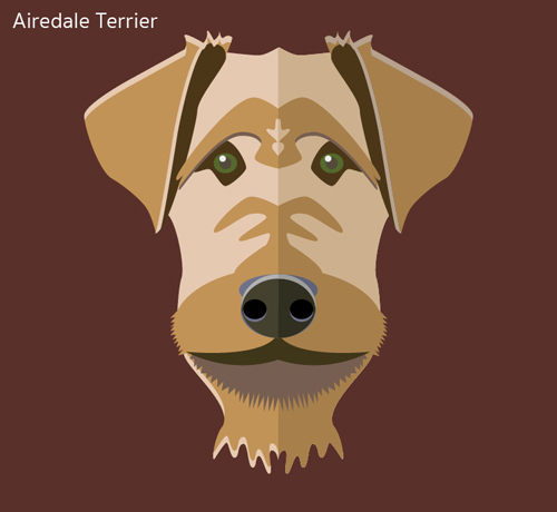
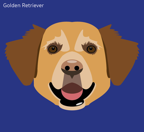
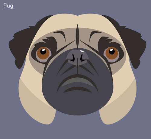
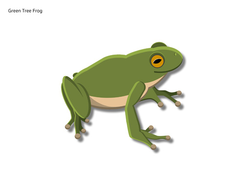
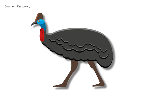
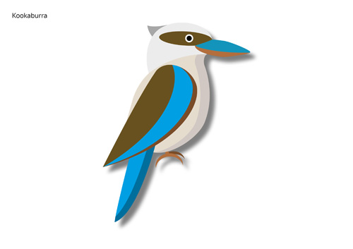
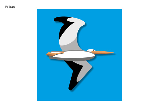
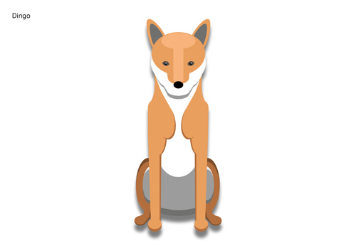
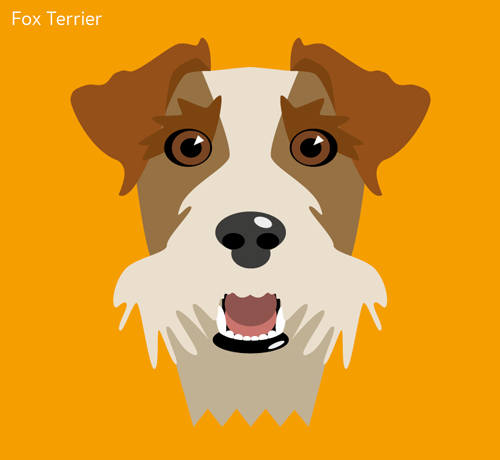
Drawing Australian animals became the theme. 

I should have used Illustrator, but I’m much more proficient at InDesign, so I bent the rules and used that instead.

(This is a disclaimer) I used a combination of Google photos and illustrations as a basis for my own illustrations. This means that they are not entirely original, but an amalgamation of styles.


Now the craft is in the label.

Saturday, October 31st, 2020

I love craft beer.

So much so that when we travelled across the US, from west to east and visa versa, we always looked for a brewpub first for the evening meal.

These places not only had great beers but also excellent wines and food. Their food and drinks were well priced, and they weren’t a slave to the US practice of tipping.

Most of the owners paid their staff a good basic wage and therefore they weren’t reliant on a tip to survive.

Most craft breweries have a very different approach to creating and marketing their products. Especially compared to the big breweries, who are just after volume and usually develop beers that are basic and designed not to challenge the drinker in any way – they don’t want to offend.

Over the last few years I have seen a profound change in the design of beer labels.

The craft breweries’ strategy of creating a unique product now extends to their labels as well.

The first craft beer that I discovered, with a very different marketing approach and attitude, was BrewDog. This Scottish brewery has become international with manufacturing in the USA, Europe and now Australia.

However their labels were nothing to brag about. Their point of difference was their attitude and they did go out of their way to offend in as many ways as possible.

It certainly didn’t damage their sales.

As the craft beer market, both in Australia and around the world has becomes more crowded, brewers needed to find another edge.

Now the label has become a tool to express their point of difference.

Below are a few that I have discovered.

BrewDog (the original) from Scotland. Brio from Berlin, Kaiju from Melbourne, KCBC (Kings Country Brewing Collective) from New York, Mikkeller from Copenhagen and the very minimalist designs of Singlecut, again from NYC.



Colour.

Sunday, August 10th, 2014

Colour or color

When I first became involved in graphic design, colour was all about print and the Pantone Matching System (PMS) was my bible.

We either used the four colour process (CMYK) or what were called ‘Specials’ or Spot Colours. These were colours mixed by the printer to PMS specifications.

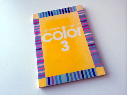
I then found an abandoned book in an agency and it became an indispensable tool for developing colour schemes.

Now most of my design work is done on screen, using Red, Green and Blue (RGB) or Hexadecimal colours (Hex) for web.

Like conventionally printed work, design for the screen is restricted to what appears best on the web.

Now my colour bibles aren’t books but websites.

Here are a couple of sites that Hayden and Evan alerted me to. They are extremely clever in the way they develop screen friendly colour schemes.


Adobe Kuler | Paleton

Same, same but very different.

Monday, March 17th, 2014

Automobiles really haven’t changed much in the last 100 years.

A box on 4 wheels with seats, lights, windows and something to steer the whole thing with.

It’s what the designer does with those elements that sets each car apart.

Take these two for example.

On the surface they look very similar. It’s only when you look closely that the quality of the design shows through.

The designer of Hyundai has integrated all the elements – the curve of the lights blends into the boot and bumper.

While the same features in the Lexus seem to be thrown together, with little regard for harmony or aesthetics.

Admittedly I am only looking at the surface features and not the build quality or engineering.

On face value the Hyundai, at $36,390, is better value, at least visually, than the Lexus at $91,138.

Automotive design

Melbourne Now.

Tuesday, February 4th, 2014

We recently visited the Melbourne Now exhibition.

The exhibition is running concurrently at the Ian Potter Centre, NGV Australia and NGV International.

It’s a huge display that showcases the latest in art, architecture, design, culture and performance, across the creative landscape of Melbourne.

It’s so large that we spent 2 hours at the Ian Potter Centre and only managed to see two thirds of what they had on offer.

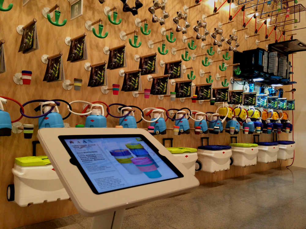
What both surprised and delighted me was the Design Wall that made up the Melbourne Design Now presentation of the exhibition.

There are nearly 700 items on display, by 21 Melbourne design studios, covering the disciplines of industrial, product, furniture and object design.

It’s great to see that we can still design and make products in Melbourne but sad to see that there were only 40 actual designs.

The 700 items were made up by duplicating the 40 designs.

IMG_0668

Not just a logo but an idea.

Sunday, March 24th, 2013

This is the South Australian Economic Development Board’s new logo.

I think it’s terrific.

It is not only pleasing to look at but it also has an idea that makes you think. And if you can make the viewer think about what you are saying then you will also have them remember you.

Once you get them to remember you, you’re on the shopping list.

This applies to any product, service or even a state.

Well done Cato Partners for the design and the South Australian bureaucrats who could see the idea in it.

Let’s hope that it does open some doors.

SA a portal into Australia

French posters. (September 2012)

Monday, October 8th, 2012

The French have a history of producing excellent posters.

Many are a strange combination of art, design, sales and humour.

I found this one, with a peculiar Australian perspective, in Chauffeur Les Bonnièreres.

A pleasant surprise.

Thursday, December 22nd, 2011

I have been aware of the MtBuller identity for some time but have never really taken much notice of it.

I thought it was a pleasant take on the snow crystal idea and left it at that.

Then last week, I had a eureka moment, when I discovered that the bottom part of the logo was a snow capped mountain (MtBuller)

The same thing happened a few years back when Federal Express made an image change.

I wondered what all the fuss was about, after all it was just a couple of words fused together in a rather ordinary sans serif typeface.

Then I noticed the arrow between the ‘E’ and the ‘x’ in Express.

It these little extras that make a good design and help both the logo and the brand to be remembered.

It’s also the consumer’s reward for taking notice and my surprise at being so unobservant.

Caravanning isn’t daggy but the vans are.

Monday, October 10th, 2011

One of the biggest problems facing the caravanning set is their image.

Not them personally, however they do need to get rid of the silly hats, but the image of the small block of flats they are towing.

Caravanning became popular in the US in the 50s’ and it seems as though the graphics used by the manufactures has been caught in a time warp from the same period.

The Googie design style was used by bowling alleys, petrol stations and caravan manufactures, with great success, just after WW2.

This retro look has been made popular again by companies who want to hark back to a simpler era, however it sends the wrong message when it comes to contemporary long haul touring.

I toured Europe in the 70s in a VW Combi Van and, for the time, it was state of the art.

It had a modern look that was devoid of all the crap graphics that are so prevalent on today’s motor homes and caravans.

Their exterior belies what is inside these travelling condos. They have Sat Nav, wireless internet and solar electricity, yet they look like they have come from an episode of Father Knows Best.

The Grey Nomads, who travel the planet in these mobile penthouses, are being branded as daggy by the very image of the brands they driving.

Form follows fun.

Wednesday, July 20th, 2011

We have got the last of our stuff out of storage, which included all our books.

As a result, I have just rediscovered ‘The Little Book of Design Classics‘ by Catherine McDermott.

As the name suggests this is a small book. It’s only 100mm wide and 145mm deep however it: “…contains more than 100 key pieces of design that have come the fabric of modern life.”

There are some serious pieces of design in here, like the Chrysler Building, in New York but there are also some more trivial things, like the Michael Graves Whistling Kettle, manufactured by Alessi.

It was due to this little book that I went and bought the Juicy Salif, Citrus-squeezer, designed by Philippe Starck and also manufactured by Alessi.

This would have to be the world’s worst citrus squeezer, as you have to place the glass underneath and provide your own strainer to catch the pips.

And even then the juice goes everywhere.

But that’s all beside the point, because every time I see it sitting on the kitchen bench, it makes me smile.

There is another great book that came out of the black hole of the storage cartons and that’s, ‘A Smile in the Mind‘ by Beryl McAlhone and David Stuart.

This is all about witty thinking in graphic design.

Sometimes a smile is all you ask of a design to make it worthwhile.