Archive for the ‘Advertising’ Category

This one came out of the blue.

Tuesday, February 28th, 2023

While having coffee at Le Capucin in Portsea, I noticed this rather lovely bit of art in the window of an antique shop near by.

I felt it was perfect for our house in Sorrento, so I decided to buy it. We have owned the place for over 30 years so this was going to be a celebration of that.

The following day, when I looked in the shop again, it was gone. I then asked the owner, Sally, if she still had it and this is where it got interesting. She told me she did and then gave me some background information to it.

It was based on a Reckitt’s Blue poster that was produced in the 1930s’ and signed by the artist Rowles. Unfortunately I can’t find any information on this particular illustrator.

I recall my mother using a Reckitt’s Blue Bag in our copper (yes, back in the 50s we had a copper). The ingredients of the blue bag was synthetic ultramarine and sodium bicarbonate. It was put in the boiling water to help whiten the washing. As most sheets and shirts were white and not synthetic back then, it was used a lot.

It was also used as a remedy for bee stings and bull ant bites. My mother used to just rub a wet Reckitt’s Blue Bag over the affected area and magically the pain would disappear.

The original Reckitt’s Blue poster, used for this piece, has been reworked to delete the ‘Reckitt’s’ and the baseline, ‘Freshness out of the Blue’ and customise it for Sorrento.

Sally then admitted that she was the artist and had created it in 1996.

I love art but when it comes with a great story, it’s even better.

Toilet Humour.

Friday, December 23rd, 2022

The graphics on this this Portaloo delivery truck are priceless.

I caught a glimpse of one of these trucks down on the Peninsula and was too slow to get a photo.

Then, a few days later, I spotted another one, this time closer to home and it was parked.

I had to get a shot.

Normally a photo of a guy, in high vis, sitting on a toilet with his dacks around his ankles, isn’t that funny. But when you make him the driver of a toilet delivery truck, it’s hilarious.

“A picture is worth a thousand words.” As they say.

Thursday, November 24th, 2022

During our recent travels, I found this old Guinness poster in Derry, Southern Ireland. 

This one was probably developed in the 1940s or 1950s and could have been illustrated by the famous British artist, John Gilroy. 

Unfortunately the available information is a little sketchy.

Around the world Guinness is an exceptionally strong brand and it’s advertising like this that has made it that way.

Arthur Guinness founded the company in St James’s Gate, Dublin, Ireland in 1759. However it wasn’t until 1929 that the Guinness family permitted the beer to be advertised. And that was with the stipulation that “The quality of the advertising was as good as the quality of the beer.”

The result is that Guinness has always differentiated itself from other ‘beers’ in a unique and interesting way. 

There are many stouts but only one Guinness. 

Another great idea.

Wednesday, September 21st, 2022


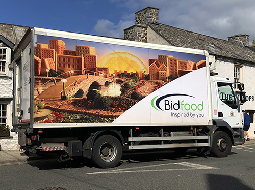
Food delivery vans can be boring, however this one is designed around a great idea. 

And it’s selling the product in a very appetising way.

I found this one in Haverfordwest, Wales.

Coke does something good for a change.

Monday, August 22nd, 2022

The Christopher Street Day Parade is a well established Pride march, held annually in Berlin.

This year it was on July 23rd. 

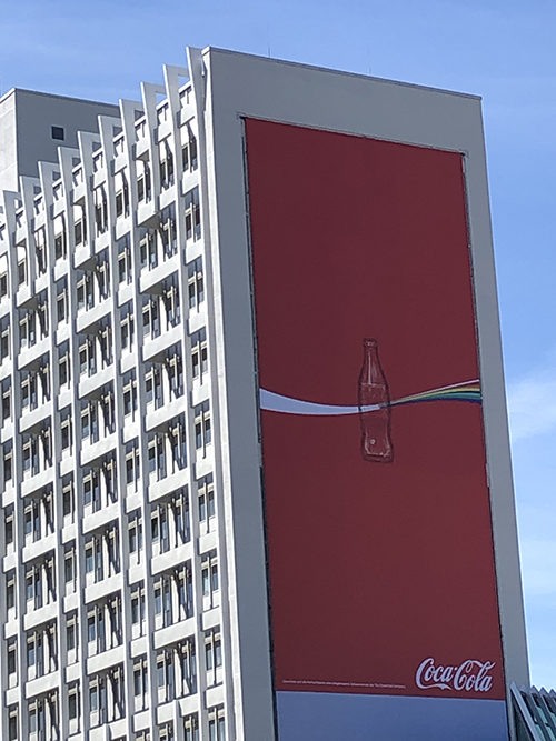
This poster, that was opposite where we were staying in Berlin, is a celebration of Coke’s support for the gay community.

It incorporates their iconic ‘swoosh’ morphing into an LBGTIQ+ rainbow, as it passes through an empty Coke bottle.

Very clever, understated and also great branding.

It’s all about placement.

Saturday, April 23rd, 2022

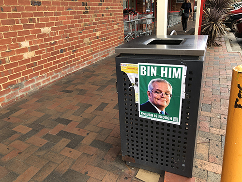
As we fast approach the May 22nd Federal election, the streets are full of political adverting. 

Most of it is boring propaganda, however this one caught my attention. 

The two word message is both simple and strong, but it’s the placement that got me.

It’s brilliant.

Apparently these posters are all over Melbourne and people have even taken to putting them on their own private rubbish bins. 

And they are paying $20 for the privilege.

The future is here.

Friday, August 27th, 2021

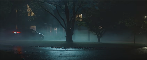
While escaping to Spain during lockdown number six, ie: watching the Vuelta a España, we were peppered nightly by the limited range of commercials on SBS Viceland.

This commercial for the Hyundai Tucson stood out.

With amazing special effects, it’s beautifully written, directed and filmed. It also has something that’s sadly missing in most ads these days – an idea.

I hope this is the future of ads.

The marketing of a road.

Wednesday, May 26th, 2021


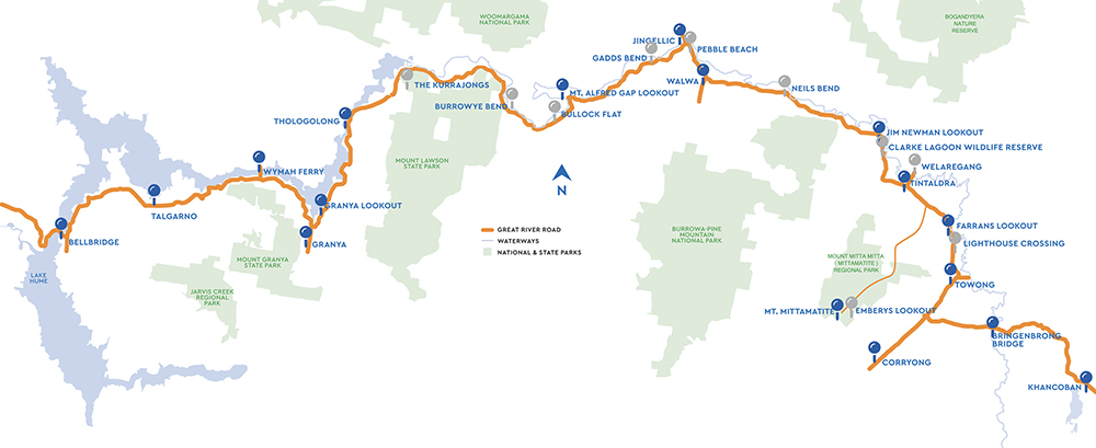
The day we returned from our Back to Yack adventure we took, what’s now known as, The Great River Road. 

The website describes the road as:

‘Set between two of Australia’s most beloved landscape icons, the Murray River and the Snowy Mountains, the Great River Road showcases 155 kilometres of beautiful high-country in Victoria’s North East – perfect for exploring at any pace.’

We started at Corryong, in the east, and then drove westward to the edge of the Hume Weir. The scenery was spectacular and there were many points of interest along the way. These included lookouts, odd bits of sculpture and historic markers.

The road was originally not one designated drive but a number of different routes.

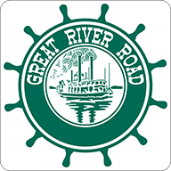
The logo that has been recently developed is used for both The Great River Road and the Upper Murray region.

Although there isn’t much information about the development of the Upper Murray marketing program, it seems to be a joint venture between the local councils, community groups and even Upper Murray Health and Community Services.

It’s clever marketing that can take something, that many people already know about, and turn it into a new adventure and experience.

However, the idea isn’t original.

The Great River Road was first created in the United States in 1938 and was used to market the Mississippi River.

The US website describes it as:

‘The Great River Road is a collection of state and local roads that follow the course of the Mississippi River through ten states of the United States.’

The US road also has a logo, which is a little outdated. I much prefer the Australian one, as it actually has an idea.

Nonetheless, I do think that a trip up, or down, the Mississippi River road would be great – especially considering they have a craft beer trail already mapped out for me. 

It’s an epic craft beer experience that takes you to 43 breweries in Minnesota, Wisconsin, Iowa, Illinois, Missouri, Kentucky, Tennessee, Mississippi and Louisiana.

It does seem an odd combination of drinking and driving. 

Souvenirs of a different kind.

Monday, December 21st, 2020

In our travels we have visited many brewpubs. 

As the rise in popularity of craft beer increases, they are now scattered all over the world.

Wherever possible I souvenir their beer mats. 

Not every establishment has them but where they do, I try and grab at least two fresh ones for my collection. 

In a year without travel, I have found them to be an enjoyable reflection of our past adventures. 

Here are a few from my collection.


Now the craft is in the label.

Saturday, October 31st, 2020

I love craft beer.

So much so that when we travelled across the US, from west to east and visa versa, we always looked for a brewpub first for the evening meal.

These places not only had great beers but also excellent wines and food. Their food and drinks were well priced, and they weren’t a slave to the US practice of tipping.

Most of the owners paid their staff a good basic wage and therefore they weren’t reliant on a tip to survive.

Most craft breweries have a very different approach to creating and marketing their products. Especially compared to the big breweries, who are just after volume and usually develop beers that are basic and designed not to challenge the drinker in any way – they don’t want to offend.

Over the last few years I have seen a profound change in the design of beer labels.

The craft breweries’ strategy of creating a unique product now extends to their labels as well.

The first craft beer that I discovered, with a very different marketing approach and attitude, was BrewDog. This Scottish brewery has become international with manufacturing in the USA, Europe and now Australia.

However their labels were nothing to brag about. Their point of difference was their attitude and they did go out of their way to offend in as many ways as possible.

It certainly didn’t damage their sales.

As the craft beer market, both in Australia and around the world has becomes more crowded, brewers needed to find another edge.

Now the label has become a tool to express their point of difference.

Below are a few that I have discovered.

BrewDog (the original) from Scotland. Brio from Berlin, Kaiju from Melbourne, KCBC (Kings Country Brewing Collective) from New York, Mikkeller from Copenhagen and the very minimalist designs of Singlecut, again from NYC.