Archive for the ‘Typography’ Category

Korea, the yin and yang.
Seoul and Hwaseong Haenggung.
(September 2013)

Monday, September 30th, 2013

The concept of yin-yang is used to describe how seemingly opposite or contrary forces are interconnected and interdependent in the natural world and yet interrelate to one another.

That perfectly describes Korea.

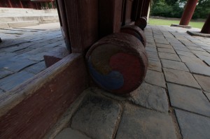
It’s therefore no wonder that the Korean flag uses yin-yang to symbolise balance within the country and its people.

Black and white, night and day, male and female, red and green, old and new.

Opposites is what South Korea is all about, especially when you consider the difference between the North and South.

Seoul is also a city of contrasts. You often see an old Korean palace, from the 17th Century, set against a backdrop of a towering steel and glass skyscraper.

It’s hard to find a rubbish bin yet the streets are free from litter.

We arrived as the Mid-Autumn Festival was in full swing in the streets around our hotel in the Insadong area. The Hotel Sunbee is well located and close to the palaces, restaurants, bars and the Metro.

On our first full day we took the ‘Hop-on-hop-off’ bus tour to get a good perspective of the city. It rained in the late afternoon so we didn’t do too much ‘hopping off’. On the two occasions that we did get off the bus we visited Gyeongbokgung Palace, first built in 1395 and then reconstructed in 1867, and Gwanghwamun Gate and stood beneath the impressive statue of King Sejong the Great, 1397-1450. At Gyeongbokgung Palace we bought a ‘Combination Ticket’ which gave us access to five sites.

The following day we visited Jongmyo Shrine, built in 1394 and now a UNESCO World Heritage site. We arrived just in time for the English guided tour. From there we walked along Cheonggyecheon or ‘The Stream’, an artery of life set below the madness of the city streets.

Contemporary architecture is a feature of Seoul and there is no better example than the new City Hall. This is literarily ‘New Wave’ architecture and when you see it set against the Old City Hall you can see how well the old and new complement each other.

More yin-yang.

Later that afternoon we arrived at Deokstgung, one of the Five Grand Palaces built by the kings of the Joseon Dynasty. This time, we were just in time, for the changing of the guard, a colorful display of  command shouting, drum pounding and band marching. The palace was a little more subdued with beautifully crafted traditional Korean architecture and and a quaint, western inspired, pavilion designed by a Russian architect at the turn of the last century.

The following morning we had a guided tour arranged and visited the Korean Folk Village at Hwaseong Haenggung and then travelled a few minutes down the road to Suwon Hwaseong Fortress.

The Korean Folk Village is as much a film set as a museum as many of the famous Korean historical dramas are shot here.

It’s also a great place to bring bus loads of Korean school kids for an outing. There were hundreds of them, all in their brightly coloured uniforms, having a wonderful time. When it came to lunchtime they all sat in neat rows and quietly ate their meal.

The Fortress was built to protect the main city and originally ran for kilometers around it, now there is only a small section remaining.

The next day we visited the Secret Garden at Changdeokgung Palace, another UNESCO World Heritage site and also built by the kings of the Joseon Dynasty (1392-1897). Unfortunately it rained again and we had to shelter under the very wide eaves of the garden buildings as we moved around. It continued raining as we moved from the garden to the palace but at least there was a bit more shelter there.

We went to find a shopping mall but instead discovered Seoul Central Railway Station built in 1927 and with many similarities to Flinders Street Station, built 73 years earlier. Inside we discovered an avant-garde typographic exhibition, ‘Typojanchi 2013’, with three floors of exhibits covering 50 years of experimental typography.

On our final morning, after a stuff up with our hotel transfer we managed to get to Yongsan Station with just a minute to spare, for our high speed train ride to Jeonju in the south west.

But even that had its upside.
I went to NerdCamp.

Wednesday, May 1st, 2013

Last weekend we went to the Melbourne WordPress WordCamp at RMIT University.

It was fantastic value at $50 for the two days, including lunch and 2 cups of excellent coffee – the preferred beverage of Nerds.

The real value came in getting to understand WordPress and how it works a little better.

I spoke with developers and a number of web designers. The one thing that surprised me was how little attention is paid to typography and type standards.

Now I find this a little strange as WordPress, blogging and websites in general are more about words than pictures.

Some of the ‘Designers’ I spoke to seemed more interested in the look of their sites and not at all interested in how well they communicated.

Most of the WordPress themes and Plugins are also all about look and not content.

The common consensus, within the WordPress community, is that there are real problems with type standards, however little is being done about it.

I come from a old school graphic design background where column width, leading, kerning and tracking were all considered essential in developing readable type.

I would be interested to see what new developments WordPress are making in this area.


Fewer choices than Gutenberg.

Monday, April 8th, 2013

Johannes Gutenberg (1398-1468) was a German blacksmith, goldsmith, publisher and most importantly a printer. He  introduced moveable type into Europe and by doing so started the ‘Printing Revolution’

This invention is regarded as being the most important event of the modern era. It allowed books to be mass produced and empowered the average person to attain knowledge.

Gutenberg’s first publication was in 1439, a bible set in a German Blackletter font. The importance of his invention was quickly recognised and typographers very soon developed new typefaces to work with this groundbreaking technology.

Within a few years hundreds of type styles were available in movable fonts.

Today’s designers are able to choose from tens of thousands of fonts when they want to print conventionally (Ink on paper).

This isn’t the case with web design.

Due to the restrictions of HTML, the language that is used to program web pages, screen quality and computer platforms, the web designer is limited to a hand full of font styles.

Google Websafe Fonts are touted as the answer but even these are subject to vagaries of technology.

A font that works well on Safari looks like crap on Firefox.

Hayden and I had a discussion the other night that followed the usual banter between a programmer, who follows logic, and a dreamer, who just wants it to be the way they want it to be.

Here is a part of the transcript of that chat.


Bruce:

G’day

Hayden:

Hey


Bruce:

We seem to have issues with Google Fonts. They look different between the Mac and PC.


Hayden:

Hmmm. What browser is Thea using?


Bruce:

Firefox.


Hayden:

Right, don’t worry, that’s normal.


Bruce:

Thea is showing me how the Google Fonts don’t work on her monitor.

So what’s the answer – Times New Roman?


Hayden:

Helvetica, Verdana.


Bruce:

Bugger that, I thought that we had some creative flexibility.


Hayden:

Well, you do.


Bruce:

But not with the fonts I want.


Hayden:

The problem is crappy font support in some browsers on Windows by the look of it.


Bruce:

This sucks. I think we should go back to HTML websites (Sites that are not WordPress) where the designers have the say and the clients just have to pay for it.


Hayden:

But these are HTML websites.

The problem is that you don’t have control over the browser used to view the sites.


Bruce:

Well they should be done in InDesign.

The smarty that develops that interface will make a fortune.


Hayden:

You can’t design a proper website in InDesign. Because InDesign doesn’t move.


Bruce:

I am talking figuratively, in that we (Designers) need to have flexibility to design.


Hayden: 

Complain to Firefox, Microsoft, Google and Apple, plus the mobile manufacturers.

It’s due to incompatibility that there are so many issues.


Bruce:

If the computer industry hadn’t embraced film editor’s thinking when they designed editing software, we would still be doing it on a Steenbeck (old film editing machines that were first developed in the 1930s’).


Hayden:

Yes but every format has its limitations.

I am still sure that there must be a way to get better fonts on here. But I’m not sure how.

I mean Titanium (A  Google Websafe Font) looks okay, except on Chrome.


Bruce:

But isn’t Chrome a Google interface and if so why doesn’t it support Google Fonts?


Hayden:

I have no idea. At the end of the day the fonts are probably handled by the operating system.


Bruce:

It’s not your fault, it’s that the industry is still run by the geeks and and not by the designers. Once it’s controlled by the creatives, not the techos, it will improve. That’s just history.


Hayden:

I’m not sure. Because at the end of the day, you’re frustrated because you’re used to a different system.

Younger designers have grown up with the current limitations. In fact they’ve grown up with more restrictions than currently exist.

So, perhaps they’ll never know.


Bruce:

Ah, but there in lies the solution. Develop a system that has unlimited creative possibilities.


Hayden:

Technically impossible.

Look at Adobe products. They don’t allow unlimited creative possibilities and they’ve been in development for over 20 years.


Bruce:

I disagree, they allowed the designer to experiment with thousands of fonts, on as many layout options as they could imagine, and they did it all in a fraction of the time it took them to do it conventionally.


Hayden:

Perhaps I’m being pessimistic.


Bruce:

Remember I was there when there was only hot metal type and a layout pad…. 

it’s come a long way since then. 


Hayden:

Yes it has.


Bruce:

We should have this discussion in 5 years time. I think it will have changed a lot by then.


Hayden: 

And you’ll be complaining that you can’t do everything you want to. (-:


Bruce:

But that’s what it’s all about. If we don’t aspire to do it differently, it will never happen.

Letterset (Rub-down letters) came into existence because typographers couldn’t kern type tightly enough with hot metal. Then when computers took over Quark had a kerning option. The same thing will happen to web design, someone will come up with a better way, they always do.

So getting back to basics, I’m stuck with Helvetica? It’s a bit like being stuck in the 60s’


Hayden:

Well now. Google fonts should work okay. I don’t know why they don’t. Perhaps you could search for the best way to use a wide range on fonts on web sites.

I’ll have a look a bit later. But I’m in the middle of some IOS development at the moment.


Bruce:

It’s not your problem, it’s just that I thought that Google Fonts were the answer but apparently there are still many issues.


Hayden:

Well I’m the programmer for Caffeine Concepts, so it’s at least partly my responsibility.


Bruce:

Touche.

That’s the extent of my French, so I will leave you to earn a Euro/Dollar.


Hayden:

You missed out the accent I think.

Touché.


Bruce:

My French isn’t that good.


Hayden:

Neither is mine.

There ought to be a law against it.

Monday, September 26th, 2011

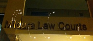
The new law courts in Mildura boasts some very glitzy relief lettering above the entrance.

This is the worst piece of kerning I have ever seen. (Kerning is the art of adjusting the space between individual letters, in a word, to create a pleasing appearance)

How come the Greeks and the Romans could carve letters from solid marble and get it right but the Mildura Public Works department, with the aid of CAD get it so wrong?

It’s in fact these very computers that we should blame for this abomination.

Hand lettering, monotype, linotype and Letraset all allowed the letters to be visually kerned by the typographer.

This all changed, with computers becoming a design tool and many fonts coming without any form of kerning. This is similar to the old typewriter where the space occupied by each letter was always the same.

The result is what we see here.

It’s a crime.

Dotcom.

Monday, March 21st, 2011

Inspired by my involvement in Alphabattle, I decided to develop a new family of typefaces.

They’re called Dotcom and Dotcomdotau.

Intended to be reproduced in two colours, they use circles, squares and lines to create abstract shapes.

It’s not the most legible family of faces about, in fact there is a clear breach of form over function.

Alphabattle

Friday, February 18th, 2011

‘Y’ and ‘Z’ are now up on Alphabattle.

Alphabattle ‘W’

Tuesday, January 4th, 2011

The letter ‘W’ is now up on Alphabattle.

Alphabattle ‘V’

Wednesday, December 22nd, 2010

The letter ‘V’ is now up on Alphabattle.

Alphabattle ‘U’

Wednesday, December 8th, 2010

The letter ‘U’ is up on Alphabattle and this time Hayden has submitted a letter.

It’s a graph, that I don’t fully understand, but then that’s typical, I don’t understand much of what he does these days.

Alphabattle

Tuesday, November 23rd, 2010

I have just submitted the letter ‘T’ to Alphabattle.

This is a great opportunity for artists and designers and the odd silly art director to submit their versions of the alphabet.

It started in February 2010 and will finish in February 2011 with a new letter submitted every 2 weeks.

I have always had a love of type and type forms. It ‘s a unique way to combine words and pictures to create an original idea.

When I was at college I designed a typeface and named it ‘Blowfly Black’. It was used in the Swinburne yearbook and I also managed to have it released as a Mecanorma rub down type.

It took me months to design the letterforms and then illustrate each letter on art board, using a Rotring Rapidograph and compass.

When I was doing a fellowship in Manchester, the computer scientists felt that it would be a great exercise to try to use their computer to do all this hard work for me. Their computer was the size of a large truck and after 4 months they gave up – I think we had got to ‘C’.

When I first got involved with the Mac, a young designer showed me a program that could create a vector version of a typeface in a matter of seconds.

I wish I had had that in 1969.