I love craft beer.
So much so that when we travelled across the US, from west to east and visa versa, we always looked for a brewpub first for the evening meal.
These places not only had great beers but also excellent wines and food. Their food and drinks were well priced, and they weren’t a slave to the US practice of tipping.
Most of the owners paid their staff a good basic wage and therefore they weren’t reliant on a tip to survive.
Most craft breweries have a very different approach to creating and marketing their products. Especially compared to the big breweries, who are just after volume and usually develop beers that are basic and designed not to challenge the drinker in any way – they don’t want to offend.
Over the last few years I have seen a profound change in the design of beer labels.
The craft breweries’ strategy of creating a unique product now extends to their labels as well.
The first craft beer that I discovered, with a very different marketing approach and attitude, was BrewDog. This Scottish brewery has become international with manufacturing in the USA, Europe and now Australia.
However their labels were nothing to brag about. Their point of difference was their attitude and they did go out of their way to offend in as many ways as possible.
It certainly didn’t damage their sales.
As the craft beer market, both in Australia and around the world has becomes more crowded, brewers needed to find another edge.
Now the label has become a tool to express their point of difference.
Below are a few that I have discovered.
BrewDog (the original) from Scotland. Brio from Berlin, Kaiju from Melbourne, KCBC (Kings Country Brewing Collective) from New York, Mikkeller from Copenhagen and the very minimalist designs of Singlecut, again from NYC.


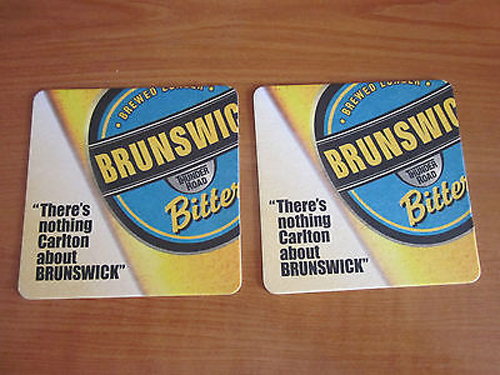


Souvenirs of a different kind.
Monday, December 21st, 2020In our travels we have visited many brewpubs.
As the rise in popularity of craft beer increases, they are now scattered all over the world.
Wherever possible I souvenir their beer mats.
Not every establishment has them but where they do, I try and grab at least two fresh ones for my collection.
In a year without travel, I have found them to be an enjoyable reflection of our past adventures.
Here are a few from my collection.
Posted in Advertising, Comment, Travel | No Comments »