Archive for the ‘Advertising’ Category

The death of the written word.

Sunday, May 19th, 2013

I no longer buy a hard copy of newspapers but prefer to read them online. They’re portable, easy to read and have high quality resolution for the graphics and photos.

In many ways they’re far superior to the printed versions.

However many of the online news and editorial articles are increasingly containing video. In fact one of our local Melbourne newspapers, The Age, is becoming more of a TV station than a newspaper.

Audio books are also on the increase and now Google has announced that their primary mode of search will be voice activated not written.

The result of this visualisation of content is that many people will prefer to have their news and information read to them rather than reading it for themselves.

When I was a kid I loved having books read to me but I only got to really appreciate the joy of literature when I started to read them for myself.

It was my voice, in my head, interpreting the words and filling in the gaps.

My voice was painting the pictures and creating ’The World’ of a particular story or author.

Advertising used to be a combined craft of the visual and the verbal, with quality pictures complementing excellent writing. Now most ads consist of an average picture, headline and a short, boring, piece of copy.

Long copy ads, that involved the reader in a journey of discovery about a product or service, have vanished. They’ve been replaced by a fast grab of visual and verbal cliches.

The beauty of the written word is that it involves you in a two way communication. You read the words, interpret them and are subsequently rewarded by that creative act of interpretation.

I loved reading the Hobbit and The Lord of the Rings by J. R. R. Tolkein. Through his craft he was able to described a world that was beyond our creation. Yet because of our imagination we were able to see that world, in our mind’s eye and visualise it for ourselves.

Seeing Peter Jackson’s interpretation of the Hobbit was exciting but no more so than creating my own vision of The Shire, Gollum and Middle Earth.

If we lose the written word we will lose the ability to create visions of our own.

And what a loss that would be.

Would you buy a ‘Gonski’?

Saturday, April 20th, 2013

If it was a fleet of the new Gonski Stealth Jet Fighters, then security and border protection would be the benefit.

If it was the Gonski High Speed Rail Link, running up the east coast, between Melbourne and Brisbane, then we would benefit from the convenience.

A Gonski Dam on the Ord River, would open up vast areas for cultivation and the subsequent benefit of increased food production.

Most Australians would see the value in paying 14.5 Billion Dollars for one of these Gonskis. That’s because we all understand what an fighter jet, rail network or a dam can deliver.

History has etched that in our minds.

Now the Gonski school funding reforms are different. It’s a complex issue to understand, let alone sell to the average punter.

There have been a number of newspaper articles written recently trying to articulate what a Gonski is. Here is the most recent one from SBS.

‘Selling’ has never been the strong point of the current government. They follow the polls when making policy decisions but don’t listen to the consumer when it comes to articulating their benefits.

They need a good advertising agency.

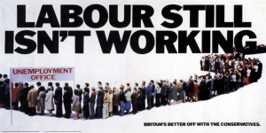
When the late, and very divicive, Maggy Thatcher came to power in 1979 she used the advertising agency Saatchi & Saatchi to sell her agenda. They came up with the ‘Labour isn’t working’ poster.’ This very quickly and simply articulated the Tory message.

I think Julia could take a leaf out of Maggie’s book and hire a good ad agency to help sell the Gonski.


French posters. (September 2012)

Monday, October 8th, 2012

The French have a history of producing excellent posters.

Many are a strange combination of art, design, sales and humour.

I found this one, with a peculiar Australian perspective, in Chauffeur Les Bonnièreres.

Osborne. (September 2012)

Sunday, September 9th, 2012

The Osborne Sherry Company was founded in 1772 by Thomas Osborne Mann.

In fact it’s the second oldest company in Spain.

In 1956 they started to erect posters, featuring their logo of a large black bull, designed by Manolo Prieto and the words ‘Brandy of Jerez’ painted in red over the bull.

The original posters were smaller but were later enlarged, to their current height of 14 meters, to comply with new laws prohibiting outdoor advertising to within 150 meters of a major road.

In 1994 another law was passed banning all outdoor advertising.

The Osborne bull was doomed.

However public response was so strong that they were allowed to remain, so long as they were painted completely black and the original brand name was removed.

I remember seeing these large, almost surreal, silhouettes in 1972, 2007 and then again in 2008.

The Osborne brand has always remained embedded in my subconscious.

Even without the product name they epitomise great branding.

The Osborne bull has risen beyond advertising and marketing to become the unofficial symbol of Spain.

He is seen on the backs of cars, on flags, stickers and key rings.

There are still over 90 Osborne bull silhouettes dotted all over Spain.

We drove nearly 600km to get some snaps of two of them.


Vodafone.

Tuesday, September 4th, 2012

We cancelled our contract with Vodafone in Australia because of their poor performance and inability to deliver on their promises.

Vodafone consistently spend large media dollars in hyping up their services. They have adopted the approach that if you continually promote a fallacy, it will become fact.

Their inability to deliver has lead to a class action in Australia and a mass exodus of their clients.

They have now suspended their considerable media spend, while they attempt to improve their coverage and services.

We stupidly selected Vodafone to purchase a broadband ‘Módem USB Stick’ for coverage in Spain.

Apparently this corporate leopard doesn’t easily change its spots.

The connection was poor and there were problems in recharging our account online.

So much so that we had to drive back to where we purchased the key and get it manually recharged there.

Their explanation was that the online service wasn’t working today but would be ok, ‘mañana’.

It still isn’t working.

Marketing works well when the delivery lives up to the promise.

Vodafone in Spain are following the Australian or more possibly the international strategy of promise first then try and deliver later.

Advertising will only work when it’s based on truth, anything else is phoney.


Globalisation.

Monday, February 13th, 2012

I will be away for the next twelve months, living and traveling in countries that don’t have English as a first language.

Also countries that have very different cultural and commercial values to what I have been used to.

Firstly North Africa, Jordan and Turkey, then the Balkans, Eastern Europe and finally into Western Europe.

Well that’s the plan.

This will be a challenge for my blog as I usually write about communication.

And, as I believe that most good communication involves both visual imagery and the written word, I think that I will be dealing with half a deck of cards.

It will be interesting to see if the contemporary approach to advertising, of more visual than verbal solutions, has really become global.

Will I just gravitate to visual solutions, because language will no longer play a part, or will there be genuinely good work that transcend language?

Typical Toyota.

Monday, January 30th, 2012

Toyota have always been more innovative marketers than vehicle designers.

The Prius is a notable exception.

They were amongst the first to develop a web presence and then very quickly followed that up by making it interactive.

Now they are at it again, this time with iPad ads.

This one popped up on The Age the other day.

I flip past most ads on The Age iPad App, as I would have done in their traditional broadsheet newspaper.

However this one stopped me because it was involving.

The reader was asked to tap on the screen to see the effect a smash would have on their internal organs.

The heart, lungs, liver and kidneys would all crack, like glass, when you tapped them.

Tap them harder and they shattered.

This ad involved the consumer in the idea.

Good ads have never been static, even if they were only in print form, they have always had the ability to bring the punter along for the ride.

Oh what a feeling.

CPR.

Monday, January 23rd, 2012

I was at a birthday party just before Christmas and one of the guests suffered a massive heart attack.

Four people, including myself, gave him Cardiopulmonary Resuscitation. It was later discovered that none of the four had ever done CPR before.

We managed to crack a couple of ribs but we kept him alive until the MICA unit arrived about 25 minute later.

We were all working on this poor guy by trying to recall what we had read in books, seen on TV or in the movies. All four of us thought that the others knew what they were doing and just followed suit.

While we were pounding his chest another of the guests was in contact with 000 where a paramedic was giving him instructions on what we should be doing.

We were being told to depress his chest 100 times a minute, this was far more that I remember, but we weren’t going to argue.

I only wish that this ad had been running, at some time, before I needed to do CPR for real.

It’s a great example of perfect casting, a very appropriate soundtrack and a simple, well told narrative.

What’s even more important, is that all these separate elements combine to make this spot stick in your memory.

And isn’t that the sort of recall you want when it’s a life and death situation?

Our ‘victim’ is recovering well and can’t wait to get us back for cracking his ribs.

Vinnie Jones Hard and Fast

Wallpaper.

Wednesday, January 18th, 2012

Advertising that’s only decorative and doesn’t communicate anything is referred to as “Wallpaper”.

I think the creators of this poster have taken the expression literally.

Insights not platitudes.

Thursday, December 1st, 2011

‘It’s all about you’ is the current positioning line for the Mazda CX9.

However it seems that this is a catch cry of a selfish, self-centered generation, rather than a line for a specific product.

It’s an attitude rather than an insight.

This same line is the title of a song from McFly and the Albanian singer Juliana Pasha. The line is also used for a diverse range of other products and causes, like: How To Get (and Keep) A Wonderful Man, The Centre for Complementary Health, Binge Drinking, Melbourne University Credit Union, a Day Spa and even, but not surprisingly, Jesus.

The result is that this line will roll of people’s consciousness like eggs off a Teflon fry pan.

‘Enjoy Christmas. Shop early’ is EBay’s line and like all good ones it’s based on a human truth.

For many people the stress of Christmas shopping can ruin the occasion. If you get it out of the way early, as EBay suggests, you will have more time to enjoy the event.

A good line needs to do more than just hold a mirror up to the consumer; it needs to connect with them.

Many ‘experts’ praise Social Media because it has the ability to create a two-way conversation with the user.

A good positioning line can do that, and more, because it demonstrates that the brand has insight into the needs of the consumer.

And like the EBay line it makes you stop, think and subconsciously nod in agreement.

After all, it’s all about you.

'Its all about you' by Tony Murphy