Archive for July, 2011

Le Tour – winners and losers.

Sunday, July 24th, 2011

I am a fan of the Tour de France.

So for the last three weeks I haven’t been into bed until way after midnight.

One of the biggest attractions has been the magnificent scenery along the route.

And last night’s time trial was amongst the most gripping TV I have seen in a long time. True, it was only guys racing the clock but there was so much at stake for Australia’s Cadel Evans.

He’s a machine.

I can’t wait to see him ride down the Champs-Élysées tonight as the winner. Only the third non-European to have won the race in its 108 year’s history.

There was another winner in this year’s tour and that was the SBS Tour Tracker App. This was a great example of well designed and well written application code. Even the live TV feeds worked.

Now for the losers.

I am afraid they were the advertisements. It was definitely the cycling and the scenery that kept me awake each night, not the ads.

Apart from the original SBS promo ad, which was excellent, the rest was crap.


If they had only run each ad once a night, then they would have been bearable but they ran them at every break and then night after night. Apart from Skoda, all the major sponsors had only produced one ad and they seemed to run them continually.

There was once a theory in media buying that frequency was the most powerful way to builds a brand message.

I think that frequency, at these levels, is the fastest way to damage a brand.
Form follows fun.

Wednesday, July 20th, 2011

We have got the last of our stuff out of storage, which included all our books.

As a result, I have just rediscovered ‘The Little Book of Design Classics‘ by Catherine McDermott.

As the name suggests this is a small book. It’s only 100mm wide and 145mm deep however it: “…contains more than 100 key pieces of design that have come the fabric of modern life.”

There are some serious pieces of design in here, like the Chrysler Building, in New York but there are also some more trivial things, like the Michael Graves Whistling Kettle, manufactured by Alessi.

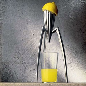
It was due to this little book that I went and bought the Juicy Salif, Citrus-squeezer, designed by Philippe Starck and also manufactured by Alessi.

This would have to be the world’s worst citrus squeezer, as you have to place the glass underneath and provide your own strainer to catch the pips.

And even then the juice goes everywhere.

But that’s all beside the point, because every time I see it sitting on the kitchen bench, it makes me smile.

There is another great book that came out of the black hole of the storage cartons and that’s, ‘A Smile in the Mind‘ by Beryl McAlhone and David Stuart.

This is all about witty thinking in graphic design.

Sometimes a smile is all you ask of a design to make it worthwhile.

No news is bad news.

Thursday, July 7th, 2011

The phone tapping scandal by Rupert Murdoch’s News of the World has been on the front pages here as well as in the UK.

Well, almost all of the front pages.

There was, however, a noticeable absence of this story in the Herald Sun, a News Limited publication.

I have always been led to believe that reporters are meant to report the big stories.

I guess it all comes down to what is regarded as a good story to report.

The News of the World may have shown no ethics but at least their advertisers have displayed some balls and pulled large hunks of advertising from their pages.

Even a brand that’s as tawdry as this one can be damaged by public opinion.

As the story broke yesterday, I would have loved to have been a fly on the wall in the Herald Sun’s editors office, or maybe I should have just hacked his phone.

Shit, I didn’t know that.

Tuesday, July 5th, 2011

How do you sell a proposition to a market that is disinterested or negative about what you’re flogging?

You reveal a point of view that gives them a new insight into the issue.

Bob Brown, leader of the Australian Greens, has discovered the power of numbers.

In a speech to the Canberra Press Club, Bob revealed that the Australian mining industry is 83% owned by offshore investors.

This suddenly casts a new light on a mining tax.

This new tax means that now we aren’t taxing Australian companies but overseas ones.

He went on to support his argument with more facts:

“Some $50 billion reaped from Australia’s mineral resources will be sent overseas as dividends to foreign owners…”

“In the next five years foreign owners will earn about $265 billion from their investments in Australia’s mineral resources.”

“For every dollar of sales, mining companies make an after-tax profit of 26% versus the average across all industries of 8%.”

What the politicians need, isn’t more spin-doctors, opinion polls or one-liners but more marketers who know how to ‘sell’ an idea.

The concept of using facts to bolster an argument has been around forever.

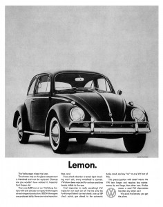
Back in the 50s and 60s Bill Bernbach, sold the new Beetle on facts, wrapped in a blanket of self-deprecating humor.

Many regard ‘Lemon’ as one of the greatest ads of all time and it’s full of facts.

“There are 3,389 men at our Wolfsburg factory with only one job: to inspect Volkswagens at each stage of production. (3,000 Volkswagens are produced daily; there are more inspectors than cars.)

“Final inspection is really something! VW inspectors run each car off the line onto the Funktionsprüfstand (car test stand), tote up 189 check points, gun ahead to the automatic brake stand and say “no” to one VW out of fifty.

Bernbach could have waxed lyrical about build quality of the VW. Except he chose to highlight the negative fact that sometimes a lemon is discovered on the production line, and that’s why you won’t get one.

This was all done at a time when ‘big was beautiful’ in American automotive design. Equally, platitudes and clichés formed the basis of most advertising copy.

If you tell people something they didn’t know, in a persuasive and entertaining way, there is a lot more chance that they will side with your point of view.