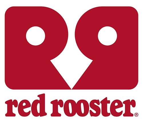
Red Rooster, has a new logo – and I rather like it.
The Australian owned fast food giant began life in 1972 in Perth, Western Australia. Since then the business has been through many changes.
It’s now a franchise operation with over 360 stores throughout mainland Australia and employs more that 7,500 staff.
The previous logos have always used red and shown a rooster
However this new one, not only has red and a rooster, but can be viewed in many ways.
Some see it as two chooks looking at each other, while others, one chook looking at you. And some might only see it as two capital letters, with one back to front.
It’s this multi dimensional approach to the design that makes it both intriguing and well branded.
It get’s you involved, which is the essence of a good design.
Although information is sparse, it seems as though it was designed in-house by the design department of the holding company Craveable Brands.
I think they should be very happy with the outcome.


