
The day we returned from our Back to Yack adventure we took, what’s now known as, The Great River Road.
The website describes the road as:
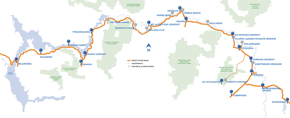
‘Set between two of Australia’s most beloved landscape icons, the Murray River and the Snowy Mountains, the Great River Road showcases 155 kilometres of beautiful high-country in Victoria’s North East – perfect for exploring at any pace.’
We started at Corryong, in the east, and then drove westward to the edge of the Hume Weir. The scenery was spectacular and there were many points of interest along the way. These included lookouts, odd bits of sculpture and historic markers.
The road was originally not one designated drive but a number of different routes.
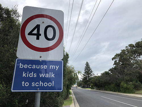
The logo that has been recently developed is used for both The Great River Road and the Upper Murray region.
Although there isn’t much information about the development of the Upper Murray marketing program, it seems to be a joint venture between the local councils, community groups and even Upper Murray Health and Community Services.
It’s clever marketing that can take something, that many people already know about, and turn it into a new adventure and experience.
However, the idea isn’t original.
The Great River Road was first created in the United States in 1938 and was used to market the Mississippi River.
The US website describes it as:
‘The Great River Road is a collection of state and local roads that follow the course of the Mississippi River through ten states of the United States.’
The US road also has a logo, which is a little outdated. I much prefer the Australian one, as it actually has an idea.
Nonetheless, I do think that a trip up, or down, the Mississippi River road would be great – especially considering they have a craft beer trail already mapped out for me.
It’s an epic craft beer experience that takes you to 43 breweries in Minnesota, Wisconsin, Iowa, Illinois, Missouri, Kentucky, Tennessee, Mississippi and Louisiana.
It does seem an odd combination of drinking and driving.


, Annecy FR")
Tees, a great way to express an idea.
Sunday, February 15th, 2026Around 2008 I discovered the fun of designing and printing my own T-Shirts.
I have made countless ones since then and still get a lot of pleasure from it.
Seeing your work in print has always been a tremendous reward for creative people.
One of the best parts about publishing them myself is that there are no clients or suits dictating what they should say or what they should look like.
Tees are worn by so many people, young and old, and can simply express an idea, sell a product or even tell a joke.
Below are some of the Tees that I have made over the years.
Christmas.
Covid.
Friends.
Melbourne.
Music.
Personal.
Political.
Product.
Religion.
Travel.
Posted in Advertising, Art, Comment, Design, Good ideas, Grumbling, Marketing | No Comments »