Archive for the ‘Design’ Category

This logo stands for nothing, just like the company.

Monday, June 26th, 2023

PwC or Price Waterhouse Cooper, is a company that is well known in financial circles.

But now it’s known nation-wide – for all the wrong reasons. 

I had heard of PwC but never been exposed to their corporate identity, until now.

However as this visual abhorrence keeps on featuring nightly in the news, I realised that there was a real connection between the logo and the company image – both are bad.

Below is a quote from the ABC’s business reporter, Daniel Ziffer, that really sums up just how rotten they are:

(PwC) “…..being involved in shaping secret government tax plans and then creating and selling a scheme to thwart them to multinational companies dubbed the ‘Dirty 30’.”

Now, in a last minute act of guilt, they have sold off all their government business for $1. 

Of course this doesn’t take into account the millions they have already made fraudulently.

PwC is a large company and I am sure they would have paid a respected design firm a good price for this logo disaster.

I can only speculate that the client got their way with the design and the designers just took the money and ran.

If I were them, I’m not sure what I would be more embarrassed about now.

The logo or the company it represents.

Toilet Humour.

Friday, December 23rd, 2022

The graphics on this this Portaloo delivery truck are priceless.

I caught a glimpse of one of these trucks down on the Peninsula and was too slow to get a photo.

Then, a few days later, I spotted another one, this time closer to home and it was parked.

I had to get a shot.

Normally a photo of a guy, in high vis, sitting on a toilet with his dacks around his ankles, isn’t that funny. But when you make him the driver of a toilet delivery truck, it’s hilarious.

“A picture is worth a thousand words.” As they say.

Thursday, November 24th, 2022

During our recent travels, I found this old Guinness poster in Derry, Southern Ireland. 

This one was probably developed in the 1940s or 1950s and could have been illustrated by the famous British artist, John Gilroy. 

Unfortunately the available information is a little sketchy.

Around the world Guinness is an exceptionally strong brand and it’s advertising like this that has made it that way.

Arthur Guinness founded the company in St James’s Gate, Dublin, Ireland in 1759. However it wasn’t until 1929 that the Guinness family permitted the beer to be advertised. And that was with the stipulation that “The quality of the advertising was as good as the quality of the beer.”

The result is that Guinness has always differentiated itself from other ‘beers’ in a unique and interesting way. 

There are many stouts but only one Guinness. 

Another great idea.

Wednesday, September 21st, 2022


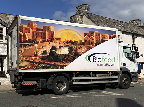
Food delivery vans can be boring, however this one is designed around a great idea. 

And it’s selling the product in a very appetising way.

I found this one in Haverfordwest, Wales.

Dam clever those Portuguese.

Friday, July 22nd, 2022

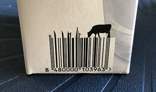
Every piece of packaging contains a barcode. 

I found this one on a milk carton in Porto, Portugal. 

How clever of the designer to use the graphics of the bar code to emphasise the freshness of their milk. 

A big healthy cow munching on fresh nutritious grass.

A total disaster.

Thursday, June 23rd, 2022


Total, the French multinational petroleum company, has decided to move into the area of sustainable power and rebranded itself as TotalEnergies.

This move to green energy is laudable, however the newly developed name and logo is to my mind, a fiasco.

It’s too complex, too long and not memorable, or even aesthetically pleasing.

The company website goes to great lengths to rationalise the new design. Which is in itself is an indication that it’s not self expiatory.

‘Total’ as a word means ‘complete’ and ‘absolute.’ So why not stay with a perfectly simple name and let the design and the accompanying PR do the work.

After all isn’t a picture worth a thousand words.

This whole project has been over thought and I can see the client’s ‘guiding hand’ being a major factor in this disaster.

A rooster booster.

Monday, March 14th, 2022

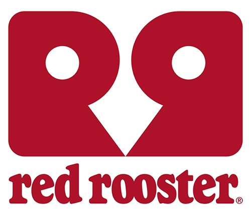
Red Rooster, has a new logo – and I rather like it.

The Australian owned fast food giant began life in 1972 in Perth, Western Australia. Since then the business has been through many changes.

It’s now a franchise operation with over 360 stores throughout mainland Australia and employs more that 7,500 staff.

The previous logos have always used red and shown a rooster

However this new one, not only has red and a rooster, but can be viewed in many ways. 

Some see it as two chooks looking at each other, while others, one chook looking at you. And some might only see it as two capital letters, with one back to front. 

It’s this multi dimensional approach to the design that makes it both intriguing and well branded.

It get’s you involved, which is the essence of a good design.

Although information is sparse, it seems as though it was designed in-house by the design department of the holding company Craveable Brands.

I think they should be very happy with the outcome.

Hierarchy.

Sunday, October 31st, 2021

I have been trained in typography and that can sometimes lead to a lot of frustrations.

Badly kerned type (the space between letters) is one of my pet gripes, as is over leading (the space between lines of type) and an incessant use of capital letters in headlines.

Just look at any American newspaper and you’ll get my drift regarding the last complaint.

There are many more that annoy me but these are a hinderance to legibility and therefore communication, and that pisses me off.

All this training has its downfalls.

I am so used to reading a page, according to the rule of hierarchy. And when it’s not applied properly I misread things.

Hierarchy is the order in which elements are placed on a page. It’s another technique typographers and designers use to aid comprehension.

When pages of type are designed by people who have English as a second language it becomes even more frustrating for me.

By not fully understanding the language, the designers place the elements in the wrong order and that disrupts my comprehension.

I spent five minutes looking for a particular item on a menu, until I discovered it was there right under my nose.

This isn’t their fault, it’s mine.

The problem is that it doesn’t follow my rules and I was blind to it being done another way.

It’s time to throw the rule book out and start to see things for what they are, not what I expect them to be.

Hot Dog.

Sunday, July 25th, 2021

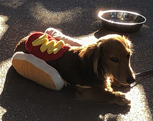
I spotted this little Long Haired Dachshund, or Sausage Dog, on one of my recent beach walks.

I kicked myself afterwards for not grabbing a snap of him in his wonderful winter coat.

Then, after the walk, when I was having a coffee, there he was.

It was meant to be – just like the coat.

Dogs are my favourite people.

Sunday, February 28th, 2021

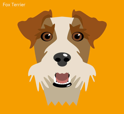
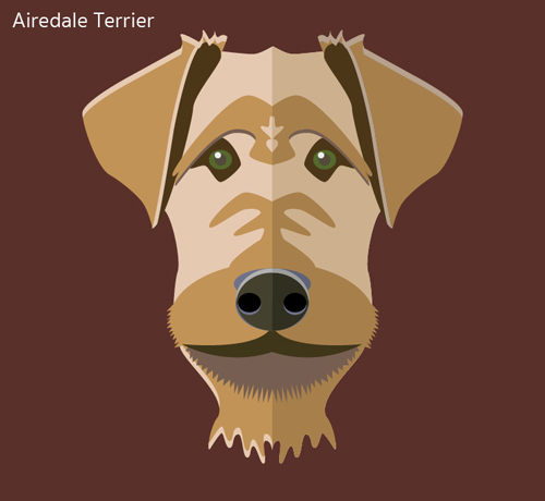
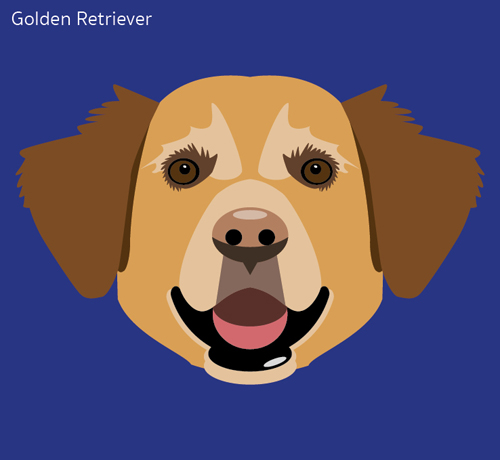
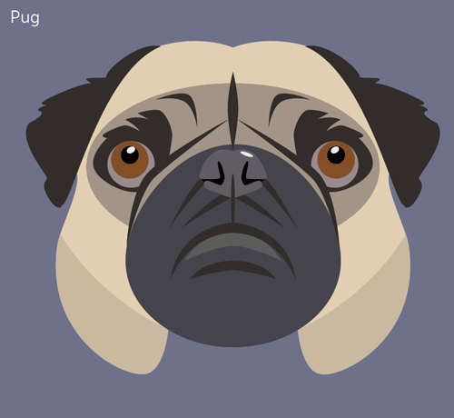
I am a dog lover and a serial dog ‘patter’.

I believe that every dog is unique, even if it’s a pure bred. They have wonderful personalities and when they look at you, I swear, they can see into your soul. 

So, as part of my computer drawing exploration, I decided to explore dog’s faces. 

Here are a few.