Winston Churchill had lopsided features, which may be a link to why he was such a successful leader of Britain during WW2.
Psychologists have discovered that people with asymmetrical features make the most effective leaders.
I wonder if the same theory might be applied to art in its historical context?
Throughout history the arts have lurched between the Classical and Romantic, or symmetry and asymmetry.
The most well known period was the Renaissance, a time of classical beauty and symmetry. This was then followed by the Baroque, a period of disturbance, mayhem and asymmetry.
This is best seen in Michelangelo’s two great works in the Sistine Chapel, Rome. The ceiling is calm and ordered, in the High Renaissance style, while the Last Judgment, in the Mannerist style, was much more chaotic. This was the pre curser to the Baroque period, where art and sculpture displayed more exuberance and exaggerated motion.
Advertising has also followed the same swings. In the 60s there was the Helmet Krone inspired VW campaign and in the 70s and 80s we had the classic British print campaigns like Sainsburys, Commercial Union and Stella Artois.
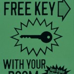
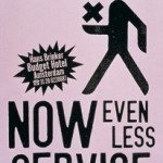
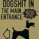
Then came the dark days of the mid 90s. This brought the off the wall and totally asymmetrical work out of Holland like the Hans Brinker Hotel work from KesselsKramer, Amsterdam. The advertising was so unusual that they even published a book titled; “The Worst Hotel in the World”
I wonder if, when times are tough, we don’t need the off the wall, asymmetric approach to selling?
After all there has never been a more confusing market place than now.
The stock market lurches between Bear and Bull and the politics waver between The Tea party and the Occupy Wall Street movement.
The WWW has opened up the Pandora’s box, that’s new media, and know one knows where that will lead us.
Or perhaps we just need some talented creative directors with lopsided features?


