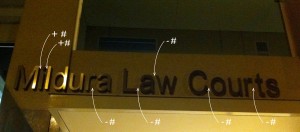
The new law courts in Mildura boasts some very glitzy relief lettering above the entrance.
This is the worst piece of kerning I have ever seen. (Kerning is the art of adjusting the space between individual letters, in a word, to create a pleasing appearance)
How come the Greeks and the Romans could carve letters from solid marble and get it right but the Mildura Public Works department, with the aid of CAD get it so wrong?
It’s in fact these very computers that we should blame for this abomination.
Hand lettering, monotype, linotype and Letraset all allowed the letters to be visually kerned by the typographer.
This all changed, with computers becoming a design tool and many fonts coming without any form of kerning. This is similar to the old typewriter where the space occupied by each letter was always the same.
The result is what we see here.
It’s a crime.


