When I first became involved in graphic design, colour was all about print and the Pantone Matching System (PMS) was my bible.
We either used the four colour process (CMYK) or what were called ‘Specials’ or Spot Colours. These were colours mixed by the printer to PMS specifications.
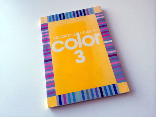
I then found an abandoned book in an agency and it became an indispensable tool for developing colour schemes.
Now most of my design work is done on screen, using Red, Green and Blue (RGB) or Hexadecimal colours (Hex) for web.
Like conventionally printed work, design for the screen is restricted to what appears best on the web.
Now my colour bibles aren’t books but websites.
Here are a couple of sites that Hayden and Evan alerted me to. They are extremely clever in the way they develop screen friendly colour schemes.


")